Parallelogram Menu In Css Using the :before and :after pseudo classes to fake oblique shapes
20 January 2014
I wanted to style a parallelogram menu lately. As i didn´t want to use graphics for this i tried it in pure css. Here is my working approach.
.navbar .menu li.active:before {
  content: " ";
  display: block;
  position: absolute;
  background-position: 0 0;
  top: 0;
  width: 20px;
  height: 100%;
  left: -20px;
  background-image: url('data:image/svg+xml;utf8,<svg xmlns="http://www.w3.org/2000/svg" version="1.1"><path d="M20 0 L20 100 L0 100 Z" fill="%2378c075" /></svg>');
}
.navbar .menu li.active:after {
  content: " ";
  display: block;
  position: absolute;
  background-position: 0 0;
  top: 0;
  width: 20px;
  height: 100%;
  right: -20px;
  background-image: url('data:image/svg+xml;utf8,<svg xmlns="http://www.w3.org/2000/svg" version="1.1"><path d="M0 0 L20 0 L0 100 Z" fill="%2378c075" /></svg>');
}
It adds a block element before and after the active menu item. Then, an inline SVG that represents a triangle is set as background image.
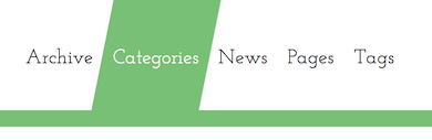
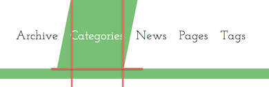
So in the end you have a rectangle surrounded by 2 triangles. The flaw of this approach is that one has to adjust it if you have a different height of the menu items or if you want different angles. But for me it worked good enough.
blog comments powered by Disqus